 Best

Best Grey Curtains
Grey curtains suit almost any room, but grey is never just grey. This guide reads warm, cool, and greige shades first, then matches depth, texture, and lining to the room.
Grey curtains work in almost any room, and that is exactly why they go wrong so often. The name covers silver, dove, mid grey, charcoal, and greige, and a curtain bought for one of those shades can behave like a different color once it hangs in your light, against your wall, and beside your sofa. This guide starts with the shade decision, then matches depth, texture, and lining to the room, so the grey you buy is the grey you live with.
Grey curtains by job: the shortlist
The six picks below cover the jobs grey does most often: darkness for sleep, texture for a living room, depth for a formal room, soft daylight for a bright room, glare control for work, and warmth for a drafty window. Each pick names its shade, its lining, and the job it suits, so you can match the pick to your room before you look at anything else.
As an Amazon Associate, we earn from qualifying purchases.
| Pick | Type | Lining | Best for |
|---|---|---|---|
| 1 | ChrisDowa 100% Blackout Curtains with Black Liner | Blackout lining | A bedroom that needs darkness without a heavy look |
| 2 | Nanspring Brownish Grey Linen Curtains | Unlined | A relaxed living room with texture |
| 3 | Helen Iron-Grey Velvet Curtains | Unlined | A formal living room that can carry depth |
| 4 | Nanspring Silver Grey Linen Back Tab Curtains | Unlined | A bright room that needs soft daylight and daytime privacy |
| 5 | SimpleHome Dove Grey Linen Curtains | Standard lining | A home office that needs glare control |
| 6 | MIULEE Linen Pinch Pleated Blackout Curtains | Thermal insulation, blackout coating | A drafty window that needs warmth as well as privacy |
1. ChrisDowa 100% Blackout Curtains with Black Liner: best for a bedroom that needs darkness without a heavy look
- Best for: A bedroom that needs full darkness at night but a light face by day, with street light outside.
- Key features: Light grey face, blackout lining, blackout result, sold as a pair.
- Pros: Keeps the room bright by day, blocks street light at night, light face suits white and pale walls.
- Cons: Light grey shows marks sooner than mid grey, check the listing for the exact light-blocking claim before ordering.
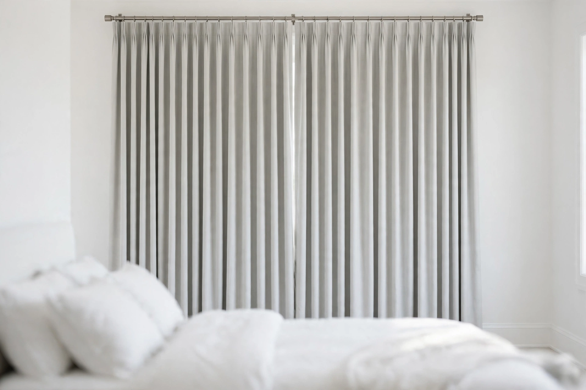
2. Nanspring Brownish Grey Linen Curtains: best for a relaxed living room with texture
- Best for: A relaxed living room where texture matters more than darkness, and daytime privacy is enough.
- Key features: Brownish grey linen-blend fabric, unlined, visible slub texture, natural drape.
- Pros: Texture keeps the grey from looking flat, unlined drape suits a casual room, mid grey hides dust better than silver or charcoal.
- Cons: Unlined panels give daytime privacy only, linen-look fabric wrinkles after washing, check the listing for the fiber content.

3. Helen Iron-Grey Velvet Curtains: best for a formal living room that can carry depth
- Best for: A large formal living room where heavy drape and tiebacks suit the scale, not a small or dim room.
- Key features: Iron-grey velvet, unlined, heavy drape, soft pile, 2 panels, 50 by 84 inches, matching tiebacks included.
- Pros: Depth and formality no flat fabric can match, heavy drape falls cleanly, pile adds warmth in a large room, tiebacks included.
- Cons: Heavy fabric needs a strong rod, iron-grey shows lint and pet hair, not a good choice for a small or dim room, unlined, so it softens light rather than blocking it.
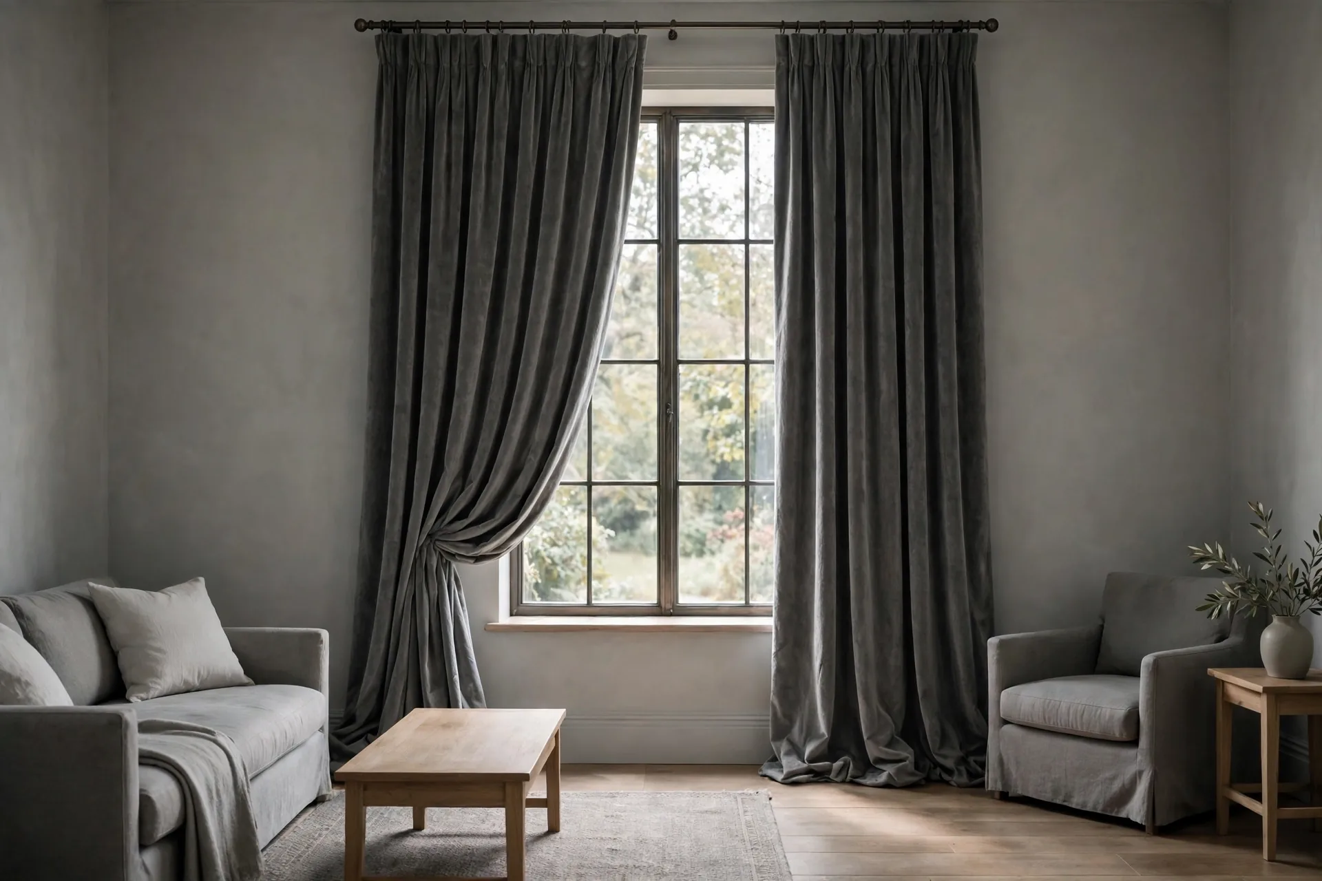
4. Nanspring Silver Grey Linen Back Tab Curtains: best for a bright room that needs soft daylight and daytime privacy
- Best for: A bright room that needs soft daylight and daytime privacy, layered with a heavier panel at night.
- Key features: Silver grey semi-sheer linen-blend fabric, unlined, soft light-filtering, light drape.
- Pros: Keeps a bright room bright, softens harsh sun, silver tone suits cool white walls.
- Cons: No privacy at night with lights on, silver can look cold against warm wood, layer with a heavier panel for evening privacy.

5. SimpleHome Dove Grey Linen Curtains: best for a home office that needs glare control
- Best for: A home office that needs screen glare cut while the room stays usable by day, against a wall that is not very pale.
- Key features: Dove grey face, white liner, grommet heading, faux-linen texture, 2 panels 52 by 84 inches, machine or hand washable.
- Pros: Cuts screen glare while keeping the room usable by day, dove tone suits most wall colors, smooth face pairs with a tailored room.
- Cons: Darkens the room more than an unlined panel, dove grey can wash out against a very pale wall.
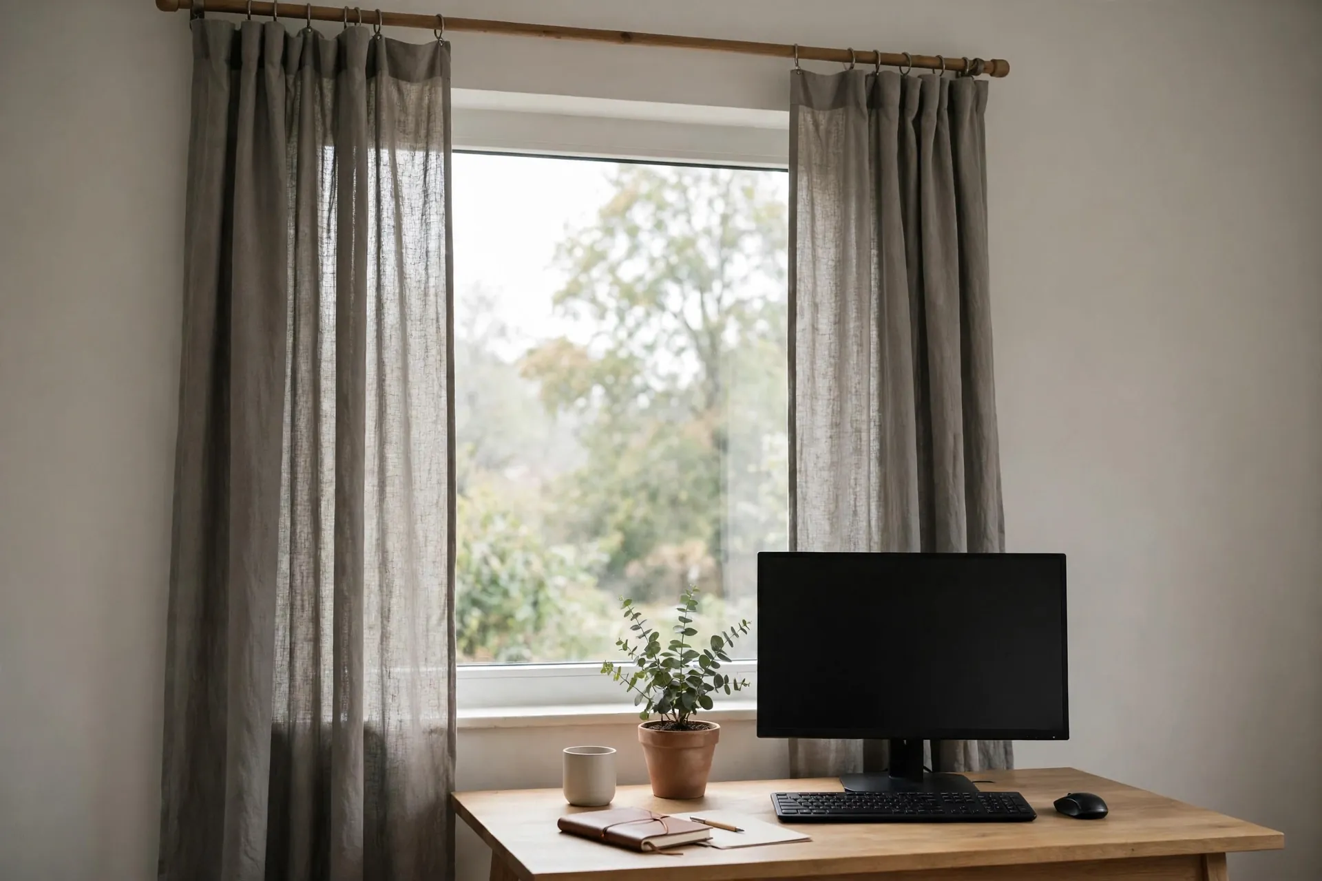
6. MIULEE Linen Pinch Pleated Blackout Curtains: best for a drafty window that needs warmth as well as privacy
- Best for: A drafty window in a cool room with wood floors, where warmth matters as much as privacy.
- Key features: Warm greige face, thermal-insulated blackout coating, insulating construction, warm neutral tone.
- Pros: Thermal lining helps a cold window feel warmer, greige warms a cool room, warm face suits wood floors and cream walls.
- Cons: Thermal panels are heavier than unlined ones, greige can read beige in warm light, check the listing for the thermal construction before ordering.
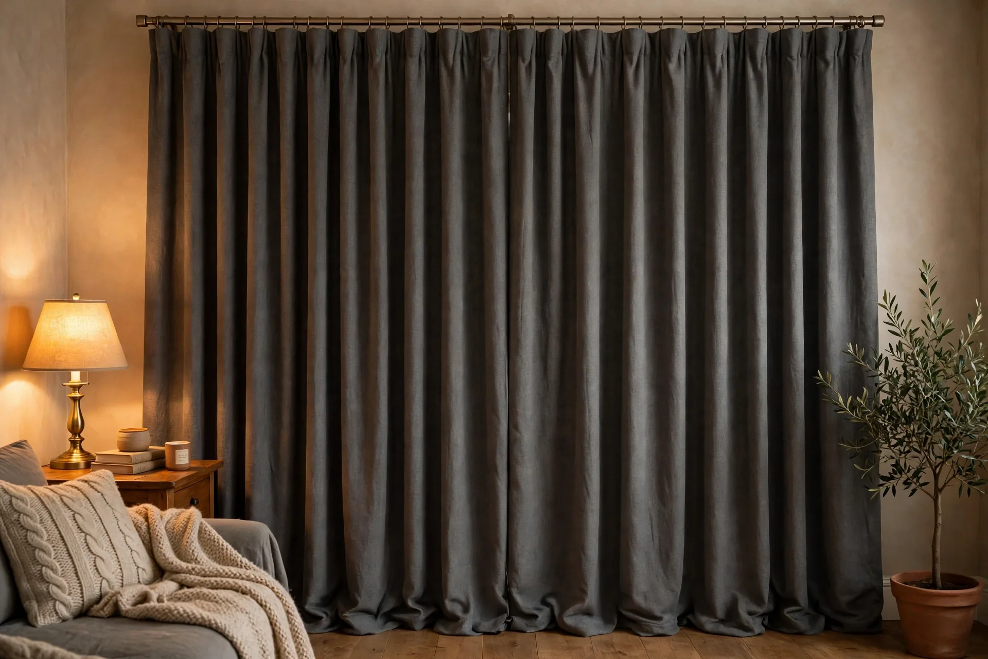
Warm grey, cool grey, and greige: reading your shade first
Start with the undertone, not the name on the packet. A warm grey leans toward beige or taupe, a cool grey leans toward blue, and greige sits in the middle, warm enough to soften a cool room and cool enough to stay grey. The undertone decides whether the curtain will sit happily against your wall or fight it all day, and it is the first thing to check before depth, fabric, or lining.
The fastest check costs nothing.
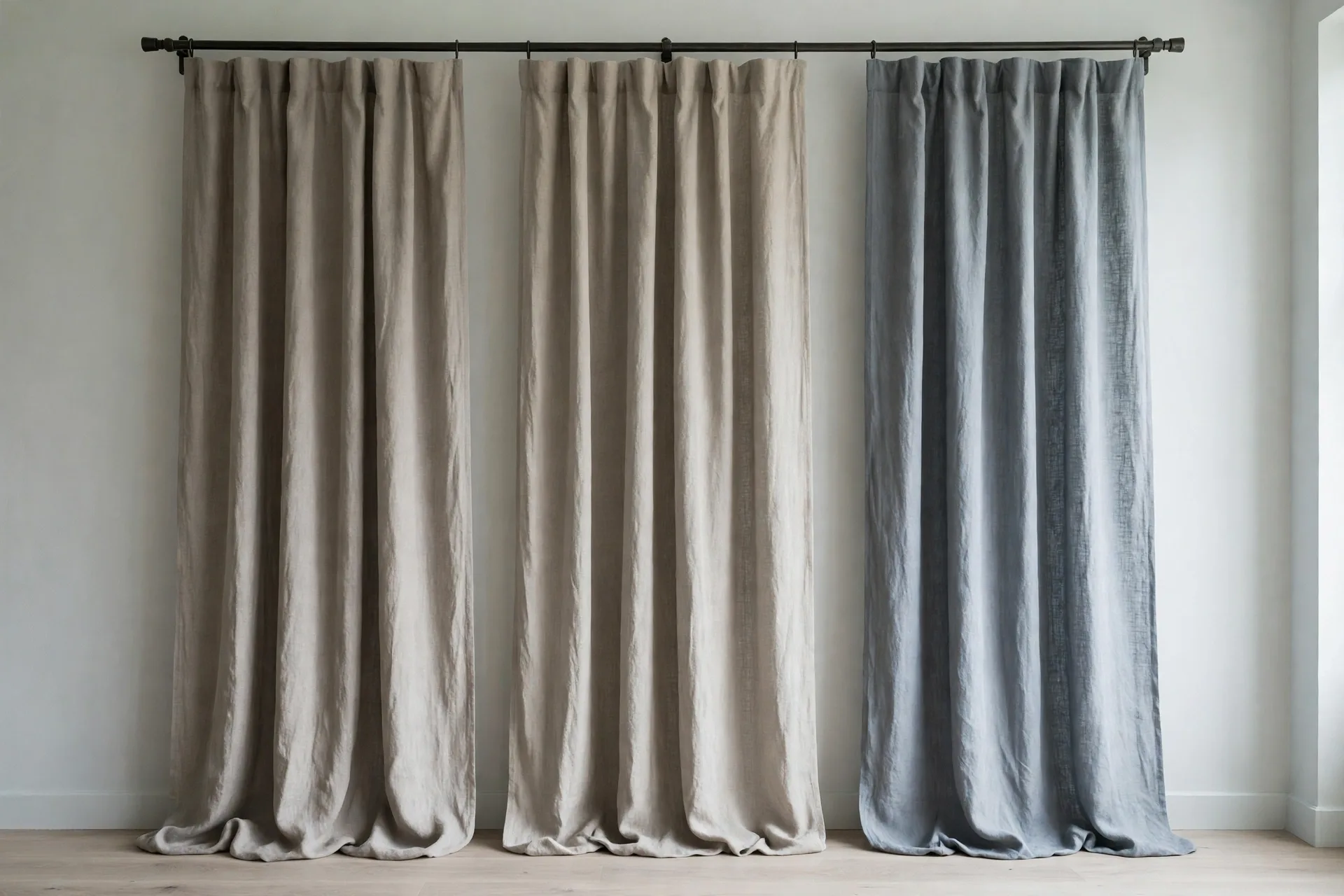
Hold the fabric against the wall in your own light, morning and evening, because grey shifts more than any other neutral as the light changes. A cool grey beside a warm cream wall can look blue and cold, and a warm grey beside a cool white wall can look muddy. If the fabric and the wall share the same warm or cool direction, they will look settled together. If they pull in opposite directions, the curtain will always look like the odd one out, even when the depth is right.
Greige is the safe middle ground when the room already mixes warm and cool elements, such as warm wood floors with cool white trim. It does not belong to either side, so it bridges both. But greige is also the shade most likely to surprise you, since it reads greyer in cool light and more beige in warm light. A sample in your own room, at two times of day, settles it faster than any name on a listing.
Two named tests make the undertone check concrete. The white-paper test holds white paper next to the grey, so the warm or cool lean shows against a true white. The neighbor test compares the grey against neighboring greys, so a warm grey stands out next to cool greys and a cool grey stands out next to warm ones. Run both in morning and evening light, because one light alone can hide the lean.
Silver, dove, mid grey, and charcoal: picking a depth
Pick the depth by the job, not by the photo. Silver grey is the lightest useful grey: it keeps a room bright, suits a small room, and pairs with cool white walls, but it shows marks sooner and gives the least visual weight. Dove grey sits one step deeper, soft and calm, and suits a bedroom or a home office where the curtain should be present without dominating. Mid grey is the workhorse: it hides dust better than silver or charcoal, suits most wall colors, and carries a living room without darkening it. Charcoal is the drama depth: it anchors a large room, frames a view, and adds formality, but it also absorbs light and needs a room that can spare it.

Depth also changes how the curtain reads at night. A silver sheer by day can look pale and airy, while the same silver in a blackout lining looks solid and purposeful after dark. A charcoal panel that looks rich in a showroom can look like a dark slab in a north-facing room with one small window. The rule is simple: the less daylight the room gets, the lighter the grey should be, and the more daylight it gets, the deeper the grey it can carry.
A grey curtain that copies the wall or the sofa disappears into it, and the window loses its edge. Give the curtain its own depth instead: a charcoal panel against pale grey walls, a dove panel against a charcoal sofa, or a warm greige panel where the walls run cool. Texture helps too: a woven or slubbed face reads as a separate surface even when the depth is close, while a flat matte panel in the same depth as the wall blends into one sheet.
Grey by room: bedroom calm, living room structure, home office focus
Grey changes its job from room to room, and the pick should follow the room, not the other way around. In a bedroom, grey's job is calm: a light or dove grey blackout panel gives darkness for sleep without the heaviness of charcoal, and the room stays restful by day. The best curtains for bedroom guide covers sleep darkness in more depth, and the same rule holds here: darkness first, depth second.
In a living room, grey's job is structure. A mid grey linen-look panel gives the room a frame and a texture, and it can carry a sofa in almost any color without competing with it. A charcoal velvet panel suits a large, formal living room, but it is too much for a small one. The living room pick should be the one that makes the sofa and the rug look deliberate, not the one that shouts loudest.
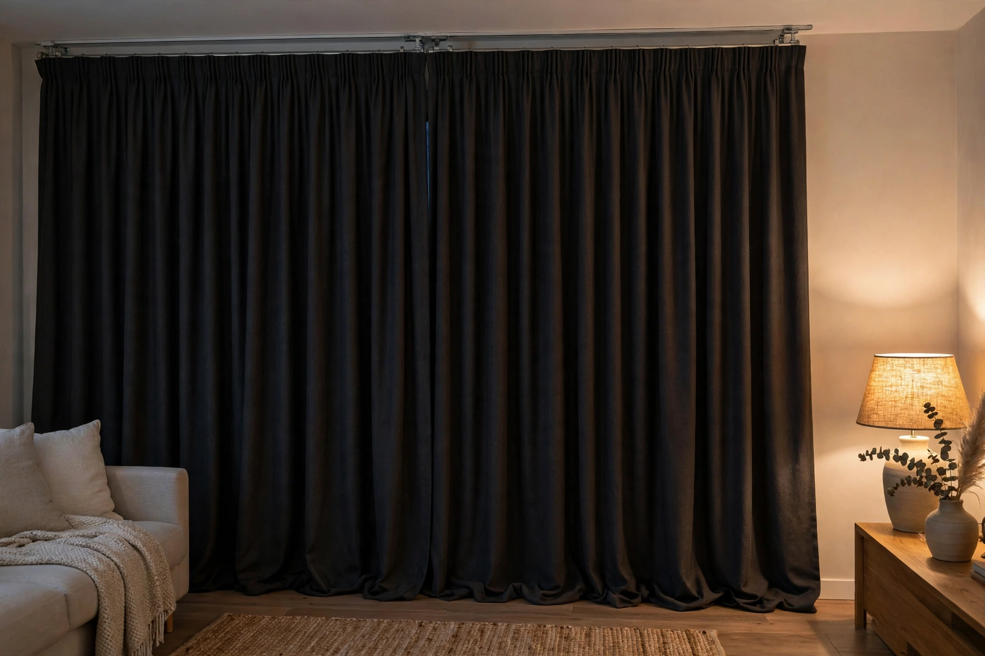
In a home office, grey's job is focus. A dove grey room-darkening panel cuts screen glare without turning the room dark, and it keeps video calls looking neutral instead of tinted. Avoid a shiny grey fabric in an office, because shine reflects light unevenly and can glare on camera. A matte grey face is the safer choice for work.
Light levels in grey: sheer, light-filtering, room-darkening, and blackout
Decide the night first, because the night decides the lining. A bedroom that has to stay dark through street lights and early sun needs a blackout lining behind whatever grey faces the room, while a living room that only needs the sun taken down a notch can stay with a lighter lining. The grey you see is the look of the window; the lining you cannot see from the front is what sets how much light gets through. Pick the lining for the darkest hour the room will see, then pick the grey for the daylight hours.
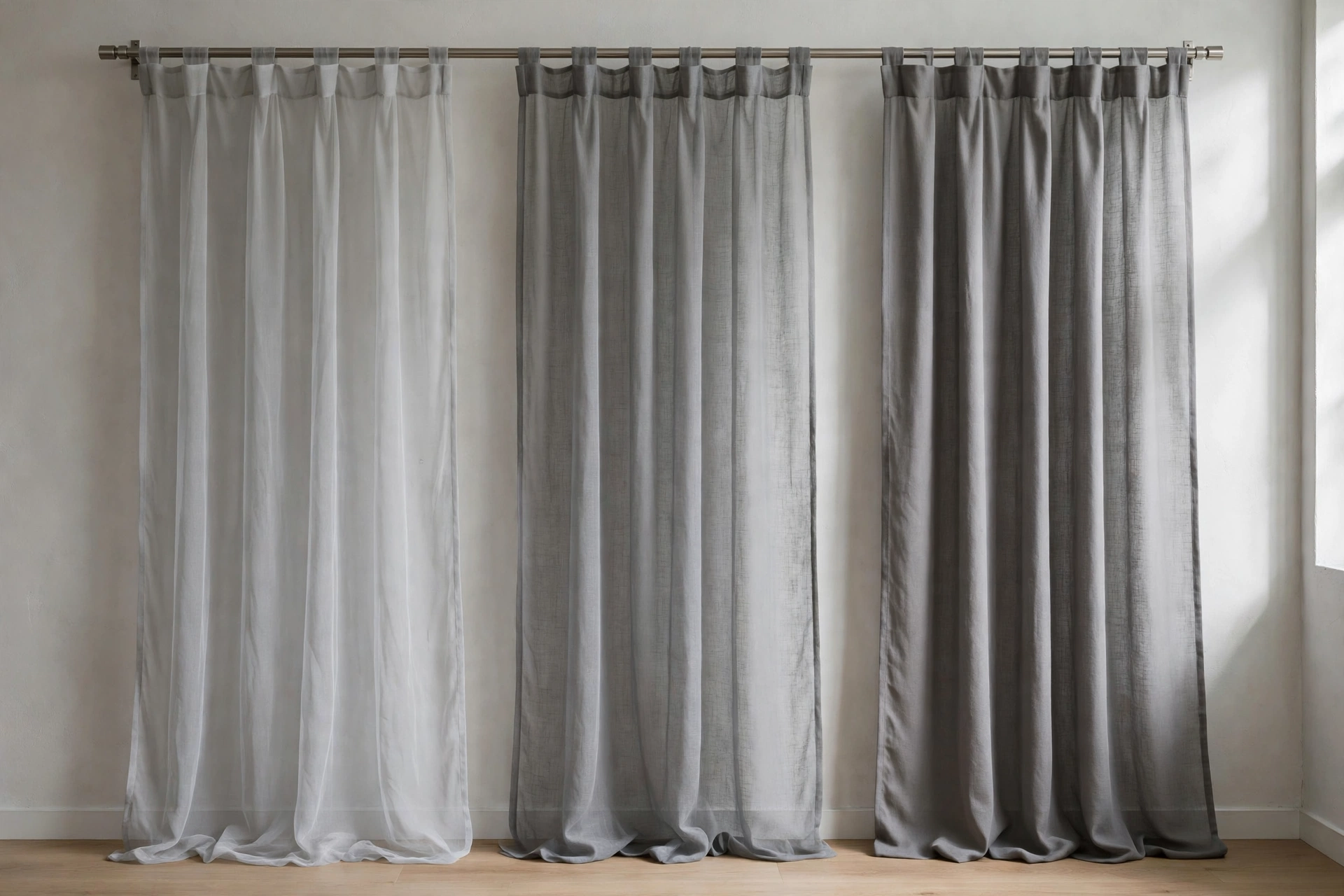
A blackout lining gives the deepest result, so it belongs in bedrooms and media rooms where darkness is the point. One step down, a room-darkening panel takes out glare and most daylight without sealing the room shut, which suits a home office or a living room with a television. A light-filtering panel only softens the sun and keeps the room bright, which suits a living room that never needs to go dark. A sheer sits at the lightest end: it lets soft daylight through and gives privacy in the daytime, but once the lamps are on at night, anyone outside can see in.
Shade and darkness are two separate choices, and the listing tells them apart if you read the back of the panel description rather than the front photo. An unlined panel in the darkest grey still lets a lot of light through, because there is nothing behind the face fabric to stop it. A pale grey panel with a blackout lining stops far more, because the lining does the stopping. Before ordering, look for the lining name and the light-blocking claim in the listing, and treat the shade as a style choice, not a darkness claim. The best blackout curtains guide explains how lining types differ, and the best sheer curtains guide covers what sheers can and cannot do at night.
Rooms that need both bright days and dark nights are better served by layering two levels than by one panel asked to do both jobs. Put a silver grey sheer on the inner rod or track for the daytime, and a mid grey room-darkening or blackout panel on the outer rod for the evening. By day the sheer stays closed and the heavy panel stays open, so the room keeps its daylight and its daytime privacy. By night the heavy panel closes over it. Buying two layers costs more up front than one, but a single layer that only does half the job usually ends up replaced, which costs more in the end.
Charcoal grey in a small or dim room: the warning and the fix
Charcoal grey is the shade most likely to shrink a room, and small or dim rooms are where the warning matters most. A charcoal panel absorbs light instead of reflecting it, so a small room with one window can feel smaller and darker once the panels go up. A low ceiling makes it worse, because the dark mass sits closer to eye level. If the room is small, dim, or both, charcoal should be the exception, not the default.
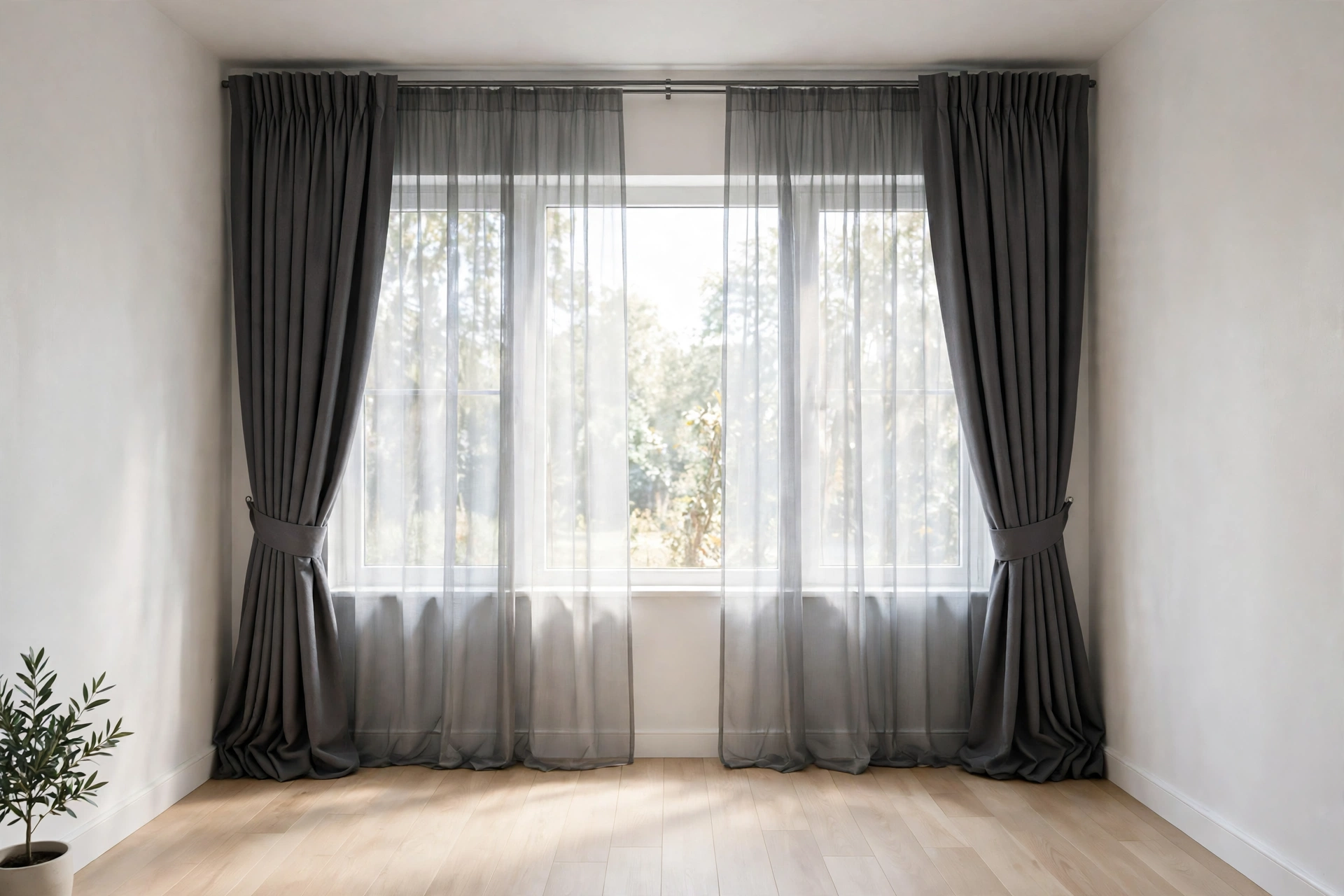
The fix, when you still want charcoal, is to give the room its light back in other places. Hang the panels wide and high, so the dark fabric stacks clear of the glass and the window itself stays as large as possible. Keep the walls light, the floor light, and the ceiling white, so the charcoal reads as a frame rather than a wall. Add a sheer layer behind the charcoal panels, so daytime light still enters when the heavy panels are open. These three moves do not make charcoal light, but they stop it from closing the room in.
The honest test is to try the darkest version last. Start with mid grey in a small or dim room, live with it for a few days, and only move to charcoal if the room still feels unfinished. Many small rooms look better with mid grey and a textured weave than with charcoal and a rescue plan. The best curtains for living room guide covers how a living room's light and size change the fabric choice, and the same thinking applies here.
Grey against grey walls: the tone-on-tone rule
Grey walls and grey curtains can look superb together, and they can also look like a grey fog. The difference is the tone-on-tone rule: shift the value, not the undertone. If the wall is a cool grey, the curtain should also be cool, but clearly lighter or darker than the wall. A cool light grey curtain against a cool mid grey wall reads as layered and intentional. A warm grey curtain against a cool grey wall reads as a mismatch, even when both are called grey.
Light direction matters as much as the shade. A north-facing room pulls grey cooler, so a warm grey curtain can steady a wall that otherwise looks icy. A south-facing room warms grey up, so a cool grey curtain can keep the room from turning beige. Check the pairing at midday and again in the evening, because a combination that works in sunlight can fail under warm lamps.
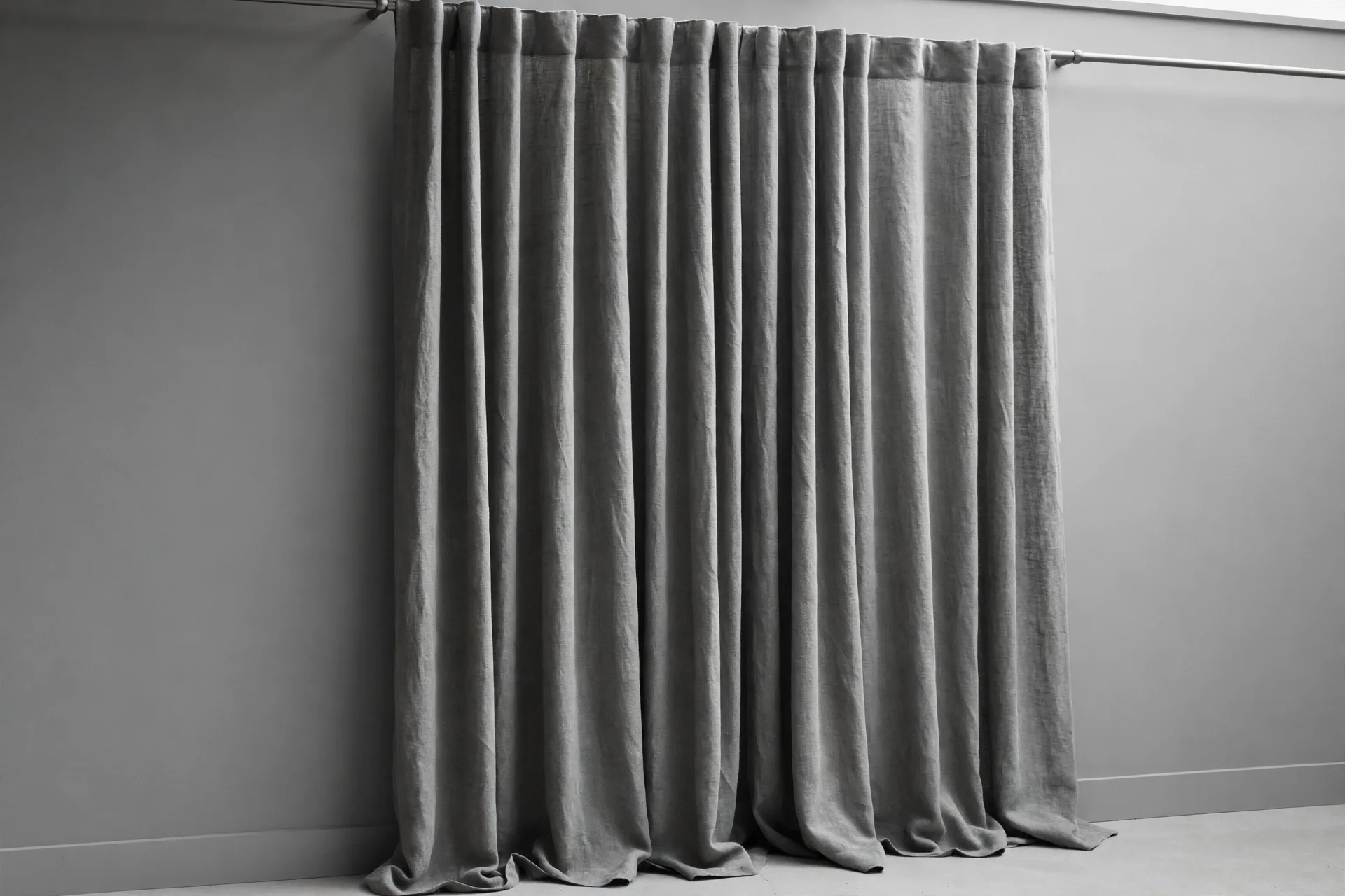
The other tone-on-tone tool is texture. Two flat grey surfaces blend into one, but a textured curtain against a flat grey wall gives the eye something to hold. A linen-look weave, a velvet pile, or a subtle slub breaks the surface without adding a new color. If the wall already has texture, such as paneling or a plaster finish, a smoother curtain face keeps the balance. One surface textured, one surface smooth: that contrast is what stops tone-on-tone from turning into a blank wall.
Warming grey up: wood, brass, and warm white
When grey feels cold, warm the room around the curtain instead of replacing the curtain. A cool grey panel against cool walls and cool light has nothing warm to lean on, so one or two warm touches beside it will do more than a new shade. Warm wood, brass, and warm white light are the three quickest fixes, and they work with the grey you already have.
Start with the wood and the metal. An oak or walnut side table, a wooden picture frame, or a brass rod with brass finials puts warmth right at the window, where the eye meets the curtain first. Then change the light: warm white bulbs in the lamps near the window soften a cool grey in the evening, while a cream throw or a warm white cushion on the sofa carries the warmth into the rest of the room. Texture helps too: a velvet cushion, a wool throw, or a linen slub in the curtain itself gives the grey a soft surface to catch the light, and a soft surface reads warmer than a flat one.
Grey curtains with wood, white trim, and warm metals
Grey and wood are natural partners, but the undertone rule decides whether the partnership works. Warm grey and greige sit happily beside oak, walnut, and warm pine, because they share the same warm direction. Cool grey beside warm wood can look chilly, unless a warm element, such as brass hardware or a cream rug, bridges the two. If the room has a lot of warm wood, lean warm grey or greige; if the wood is pale ash or whitewashed, a cool grey keeps the room feeling clean.

White trim is grey's best friend, because it draws a crisp line between the curtain and the wall. A grey curtain against white trim reads as framed and finished, even when the wall behind it is also grey. The trim does the separating work, so the curtain and wall can sit closer in depth without blending. If the trim is cream rather than white, warm grey or greige will sit better than cool grey, for the same undertone reason.
Warm metals finish the pairing. Brass, aged gold, and bronze rods warm a cool grey curtain, while matte black rods suit a modern grey room and keep the look quiet. Chrome and brushed nickel suit a cool grey room, but they can make a warm grey room feel clinical. The rod is a small detail, but it is the detail the eye meets first at the top of the curtain, so it sets the temperature for the whole window.
Accents keep a plain grey room from looking flat. Navy and black deepen it, mustard and dusty rose warm it, olive and sage soften it, burgundy adds weight, and lavender cools it. A floral pattern works as an accent too, on cushions or a rug, while the grey panel stays plain so the room keeps one calm ground.
Texture over pattern on a flat grey wall
When the wall is flat and grey, texture beats pattern almost every time. A patterned curtain on a flat grey wall has to carry all the visual interest in the room, and a bold print can quickly feel like the only thing happening. A textured grey, by contrast, adds depth without adding a second story: the weave, the pile, or the slub gives the eye detail at close range and calm at a distance. The room still reads as grey, but it no longer reads as empty.
This is where the fabric choice does the work.
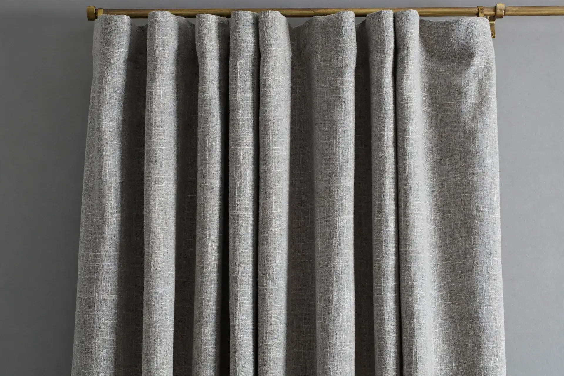
A linen-look weave suits a relaxed room, a velvet pile suits a formal room, and a smooth twill suits a tailored room. Each one changes how light plays across the curtain, and that play of light is what keeps a grey wall from looking flat. A sheer grey layer adds a second kind of texture: the soft diffusion of daylight itself, which makes the wall behind it look warmer and less stark.
Pattern is not banned, but it needs a reason. A small, quiet pattern, such as a tone-on-tone stripe or a faint geometric, can work when the rest of the room is plain. A large, high-contrast print on a flat grey wall usually fights the wall instead of finishing it. If you love a print, keep the grey in it close to the wall grey, and let the print be the accent, not the argument.
Avoid high-shine satin on a flat grey wall, because it reads cold against grey and shows every flaw in the fall, from creases to uneven folds. A matte texture hides those flaws and keeps the grey soft, which is why texture, not shine, is the safer interest on grey.
Rods, fullness, and length for grey panels
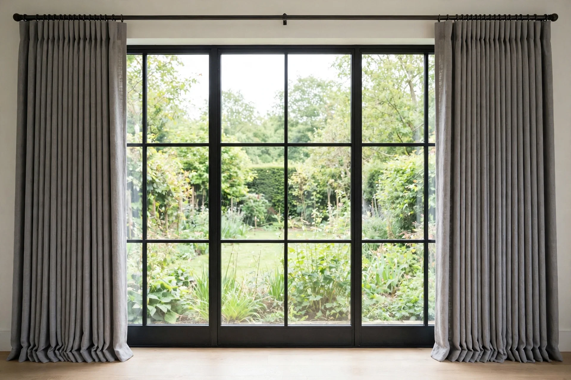
Size the rod before you size the curtain, because the rod sets how wide and tall the window looks. Fix it above the frame and let it run past the frame on both sides, so open panels stack clear of the glass and closed panels still cover the frame. Order panels whose combined width runs 1.5 to 2 times the rod width for a standard look, 2 to 2.5 times for a full look, 2.5 to 3 times for pinch pleat, and 2 to 2.5 times for sheer, so the folds stay full instead of pulling flat. Let living room and bedroom panels reach the floor, and save sill length for small or utility windows. Choose a grommet heading for panels that move every day, and a rod-pocket heading for panels that mostly stay put.
Grey fading, dust, and washing: keeping grey looking grey
Fading on grey is easy to miss, because it happens slowly and one panel at a time. Sunlight wears the dye down a little at a time, and the fold edges go first, since they catch the most light. A lined panel fades more slowly, because the lining stands between the sun and the face fabric. Turning the panels around now and then spreads the wear, so no single edge always faces the glass. In a window that gets hard direct sun, a sheer liner hung between the glass and the curtain gives the face fabric one more shield.

Dust shows on grey sooner than on a busy print, because there is no pattern to hide behind, and mid grey hides it best of the four depths. Silver shows dust and marks sooner, and charcoal shows lint and pet hair sooner, so the depth you pick also picks how often you will be cleaning. Shake the panels outside once a week, or run a vacuum with a brush head over the folds. For washing, follow the care label, and read the GINETEX care symbols on it first: the symbols say if the fabric can go in the machine and how hot the water can be, which habit alone will not tell you.
A fabric that carries the OEKO-TEX STANDARD 100 label has passed tests for harmful substances in the finished fabric, which matters most for a bedroom curtain that hangs close to where you sleep. The label is a substance test, not a quality grade: it says nothing about how well the curtain is made, how long it will last, or whether its color will hold in the sun. Treat it as a safety check to look for next to the care label, and judge fading and wear from the lining and the fabric instead.
Grey mistakes that make a room look flat or cold
Grey goes flat when everything in the room sits at the same depth: wall, curtain, and sofa all in one mid grey, with nothing to separate them. Shift one of the three a clear step lighter or darker and the room gets its edges back. The same step rule saves a small room from charcoal, which soaks up the light a small room cannot spare, and it saves a pairing where the undertones pull apart, such as a cool grey curtain against a warm cream wall or a warm grey curtain against a cool white wall. In each case the curtain is not the wrong color; it is the wrong step or the wrong direction.
The next mistakes happen before the curtain reaches the window. A grey that looked right on a screen can look blue, beige, or muddy at home, because grey moves more than any other neutral between screen light, shop light, and home light, so check a sample in your own room in the morning and again in the evening. Then match the lining to the job before you pick the shade: an unlined panel will not darken a bedroom, and a blackout panel will feel too heavy in a bright living room that only needed daylight softened.
Hang the rod wider and higher than the glass, and the window gains presence instead of looking cramped. Panels that stop at the glass edges crowd the frame, while panels that run past the frame on both sides and sit above the top let the grey fall in full folds and make the room feel taller. Rod placement is covered in the how to hang curtains guide, and the widths to order are in the how to measure for curtains guide, so the panels you buy fill the space they hang in.
Frequently asked questions about grey curtains
Grey questions here cover shade, depth, and dust, and the answers point back to the sections above.
Do grey curtains go with grey walls?
Yes, when the curtain is clearly lighter or darker than the wall and shares the same warm or cool direction. An exact match looks flat, and opposite undertones look like a mismatch. Move the curtain at least one clear step in depth from the wall, and add texture so the two surfaces do not blend.
What color curtains go with grey walls besides grey?
White, cream, beige, and soft blue all work with grey walls, and the choice depends on the wall's undertone. Warm grey walls suit cream and beige, cool grey walls suit white and soft blue, and a bold accent such as mustard or dusty rose can lift a plain grey room. Grey curtains remain the calmest choice when the room already has strong colors elsewhere.
Is charcoal grey too dark for a small room?
Usually yes, unless the room has strong daylight, light walls, and panels hung wide and high so the fabric stacks clear of the glass. A small or dim room generally looks better with silver, dove, or mid grey, and a textured weave adds interest without absorbing light. Try mid grey first, and move to charcoal only if the room still feels unfinished.
Do grey curtains make a room look cold?
They can, when the grey is cool, the walls are cool, and nothing warm balances them. Warm wood, brass hardware, cream bedding, or a greige shade all warm a grey room. A cool grey room with white trim and warm lamps can also feel crisp rather than cold, so the fix is usually one warm element, not a new curtain.
What is the difference between grey and greige curtains?
Grey is a neutral with no strong warm or cool lean, while greige blends grey with beige, so it reads warmer than grey and cooler than beige. Greige suits rooms that mix warm and cool elements, such as warm wood floors with cool white trim, but it shifts more with the light, reading greyer in cool light and more beige in warm light.
Do light grey curtains block light?
Light grey curtains block light only as much as their lining allows: an unlined light grey panel lets most daylight through, while the same shade with a blackout lining blocks it. The shade alone says nothing about how dark the room will get, so check the listing for the lining and the light-blocking claim.
How do I keep grey curtains from fading?
Use a lined panel, add a sheer liner in strong sun, and rotate the panels now and then so the same fold edge does not always face the light. Wash as the care label directs, and keep the panels out of constant direct sun where possible. Fading starts at the fold edges, so checking those edges now and then catches it early.
Are grey curtains good for a home office?
Yes, grey is a steady choice for video calls, because it sits quietly behind you instead of competing with your face. Pick a dove or mid grey panel in a matte weave, and let the room-darkening lining do the glare work, since a shiny face is what throws light back at the camera. Keep the panel closed behind the desk for calls, and the background stays even from morning to evening.
Do grey curtains show dust and pet hair?
Mid grey hides dust better than silver or charcoal. Silver shows marks sooner, and charcoal shows lint and pet hair sooner. A weekly shake or a vacuum with a brush head keeps any grey looking fresh, and a lint roller handles pet hair on charcoal between washes.
This guide is research-based curation: we compared maker specifications, published reviews, and current prices. Read how we choose.